Textkiller
Textkiller, designed as a companion to Robokiller for tackling spam texts among younger users, needed a rebrand to stay relevant in an evolving market. We set out to create a fresh visual identity that would resonate with modern demographics while seamlessly integrating with Robokiller and the broader telecommunications app portfolio. This redesign focused on a new brand identity, color palette, and visual style, establishing Textkiller as a distinctive and engaging solution in the spam text market.

Milan, Italy
2020
Telecommunications
$10.5 million (2020)
400+
Challenge
The main challenge in the rebranding of Textkiller was ensuring that the new visual identity would resonate with younger users while maintaining alignment with the established Robokiller brand and the broader telecommunications app portfolio. The need for a fresh, engaging design required balancing modern aesthetics with the functionality of the app, ensuring that the rebrand effectively communicated its core value of tackling spam texts without alienating existing users or disrupting the product’s integration with Robokiller.
Results
The rebranding of Textkiller successfully met these challenges by establishing a unique, modern visual identity that appealed to its target demographic of younger users. The updated design ensured seamless integration with Robokiller and the larger app ecosystem, maintaining brand consistency across the portfolio. Through the development of a flexible, user-centric design system, we improved user experience, resulting in stronger engagement and a clearer positioning of Textkiller as a standout solution in the spam text market.


Process
Research and Audience Analysis: We began by analyzing Textkiller's target audience, primarily younger users and their preferences for modern, clean, and engaging design. Understanding their values and behaviors helped us shape a brand identity that would resonate with this demographic while staying relevant within the spam text market.
Brand Identity Development: Our next step was to create a fresh brand identity that differentiated Textkiller from competitors while maintaining a connection to the Robokiller app. This involved designing a new logo, color palette, and typography that felt modern, approachable, and in line with the broader telecommunications brand.
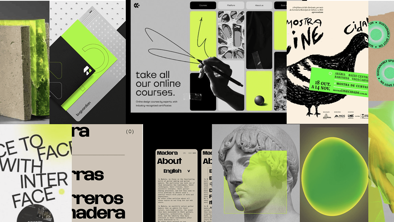
Visual Style Creation: We developed a visual style that combined bold graphics and subtle design elements, like the ‘Etch’ lines, to guide users through the app and across various customer touchpoints. This design approach unified photography, illustrations, infographics, and interactive elements into a seamless and engaging user experience.
Flexible Identity System: The brand identity system was crafted to be flexible, allowing for consistency across different platforms and use cases. This included applying the core design elements to the app interface, website, marketing materials, and promotional assets, ensuring a cohesive brand presence at every touchpoint.


Conclusion
The rebranding of Textkiller successfully established a distinct visual identity that resonated with younger users while seamlessly integrating with Robokiller and the broader app portfolio. Through a modern, flexible design system, we enhanced user experience across all touchpoints, ensuring consistency and engagement. The redesign positioned Textkiller as a unique and appealing solution in the spam text market, fostering stronger connections with its target audience.