iTranslate
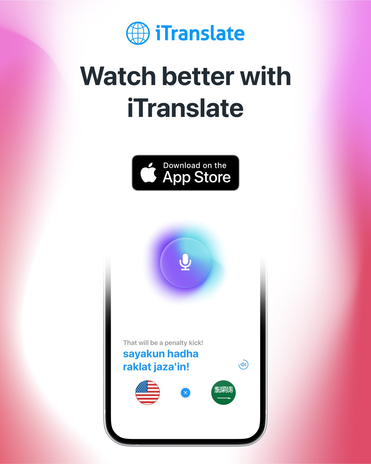
At iTranslate, a leading translation app that helps users communicate in over 100 languages, I collaborated with the marketing team to create impactful visual assets. I designed diverse App Store screenshots to highlight key app features and developed promotional materials that reinforced iTranslate’s mission of empowering global communication. Through strategic design, I helped enhance the app’s visibility and user engagement across various marketing channels.

Graz, Austria
2009
Communication
$6.2 million (2022)
50+
Challenge
iTranslate faced a challenge in increasing user engagement and app visibility in a competitive app market. Despite offering communication tools in over 100 languages, the app needed more compelling and clear marketing visuals to effectively convey its unique features to potential users, leading to underwhelming conversion rates in the App Store and other marketing channels.
Results
By collaborating with the marketing team to design impactful visual assets, including App Store screenshots and promotional materials, I helped highlight iTranslate's key features and reinforced its mission of global communication. This strategic approach significantly improved the app’s visibility, driving higher engagement and better conversion rates across various marketing platforms, ultimately contributing to the app’s growth and user acquisition.

Process
Research and Strategy: We began by analyzing iTranslate’s target audience, market trends, and competitors to understand what visuals and messaging would resonate most effectively with users. I collaborated with the marketing team to define key features and values to emphasize.
Conceptualisation: Using insights from research, I brainstormed and sketched initial concepts for App Store screenshots and promotional materials, focusing on clean, engaging visuals that highlighted the app’s diverse language features and ease of use.
Design and Iteration: I created multiple design drafts for each asset, experimenting with layouts, typography, and color schemes that aligned with iTranslate’s brand. Through feedback sessions with the team, I refined the designs to ensure they effectively communicated the app’s benefits and were visually appealing.


Conclusion
Through a collaborative and strategic design process, I was able to create visually compelling assets that effectively communicated iTranslate's core features and mission. By aligning the designs with the app's brand and user needs, I helped improve its visibility and engagement across key marketing channels, ultimately contributing to a stronger presence in a competitive market.
